View
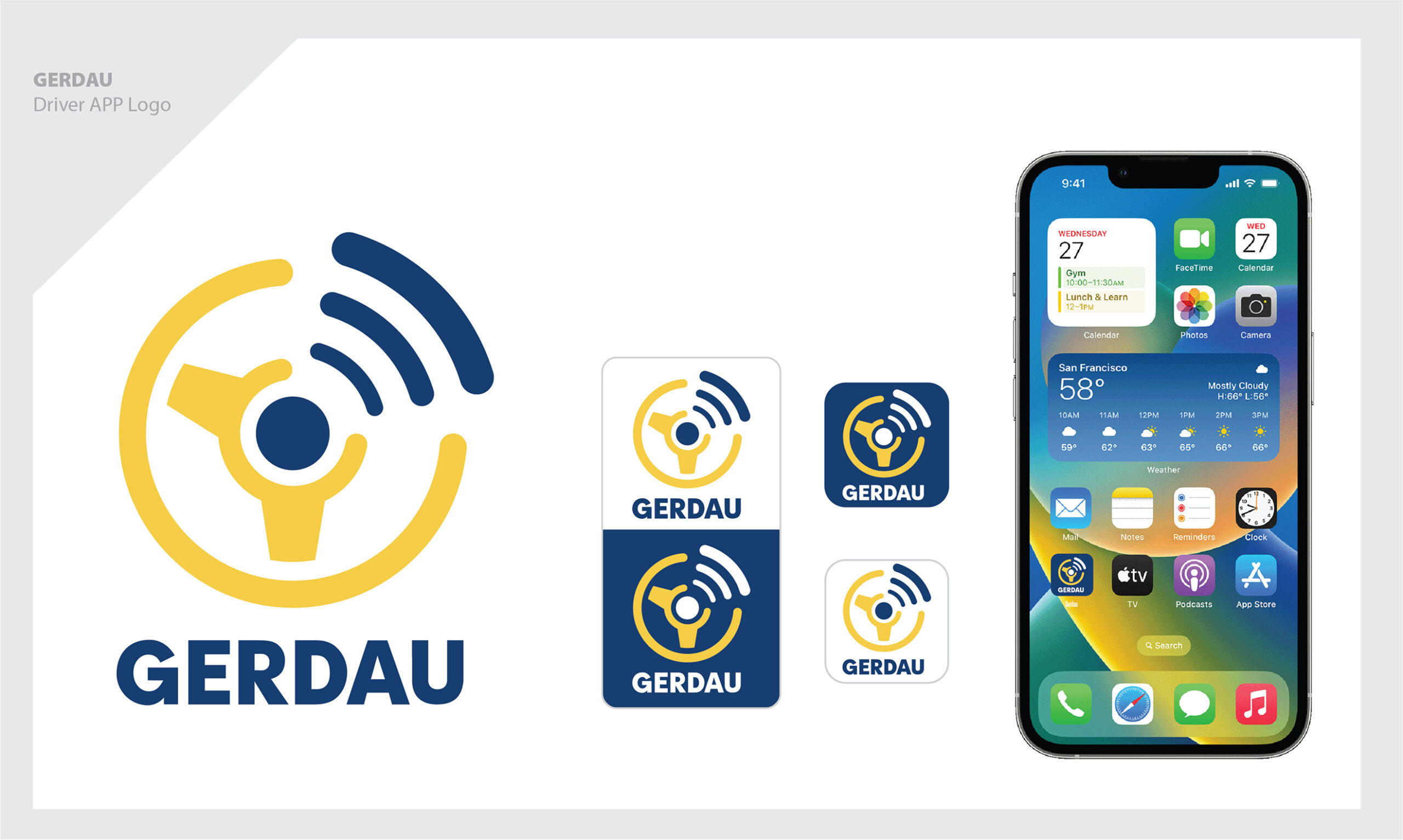
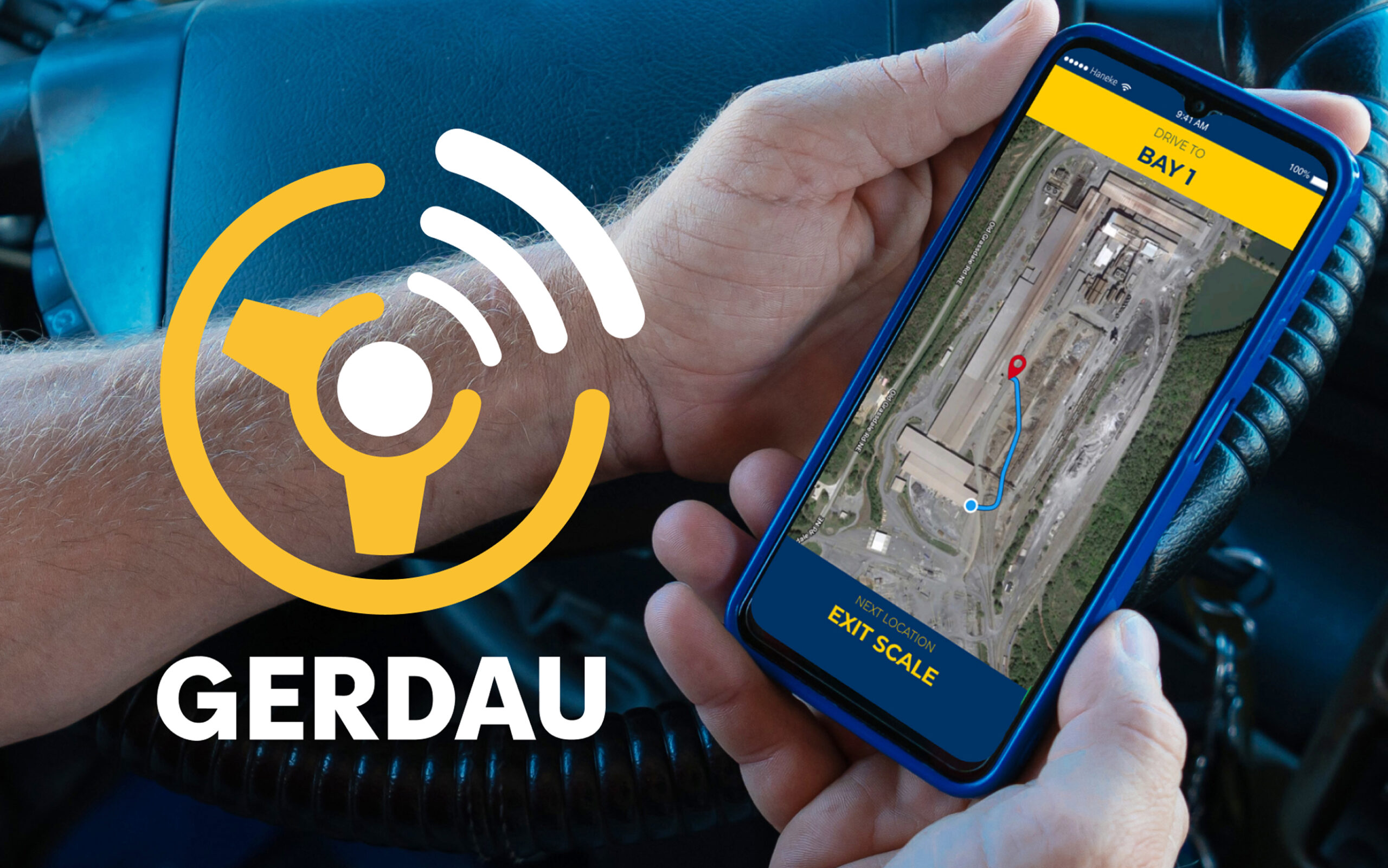
Gerdau Driver app logo
Brand Identity
The design of the Gerdau Driver app logo was created to reflect clarity, reliability, and movement—core values of the app experience. The logo uses bold, streamlined shapes to symbolize strength and structure, while incorporating directional elements that represent progress and forward motion. By balancing simplicity with recognizability, the logo ensures drivers can quickly identify the app while also aligning with Gerdau’s established brand identity.
Role
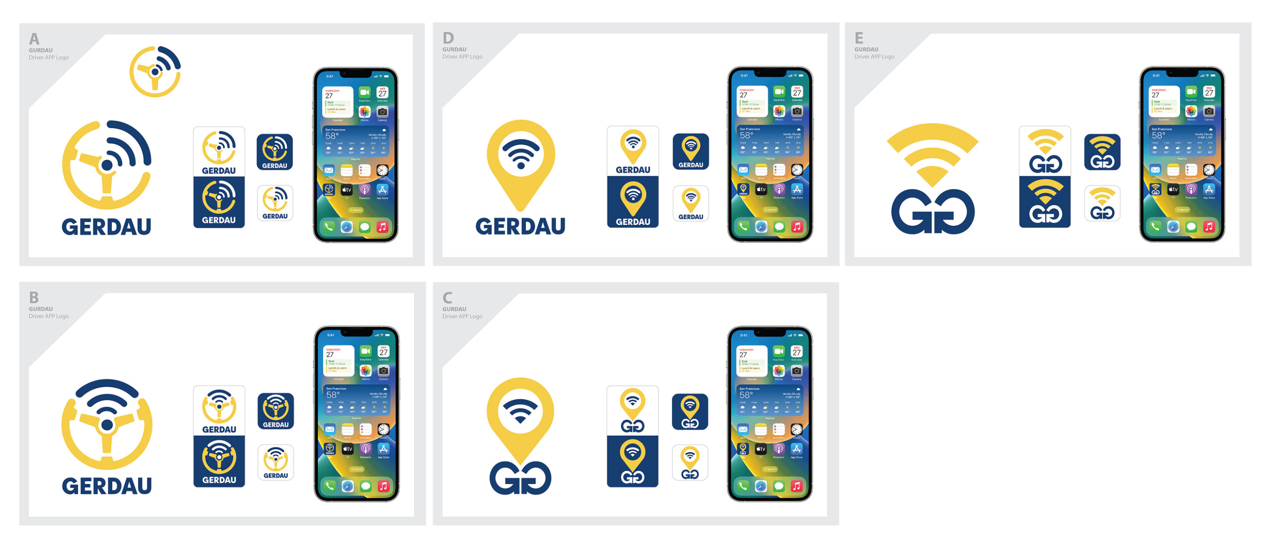
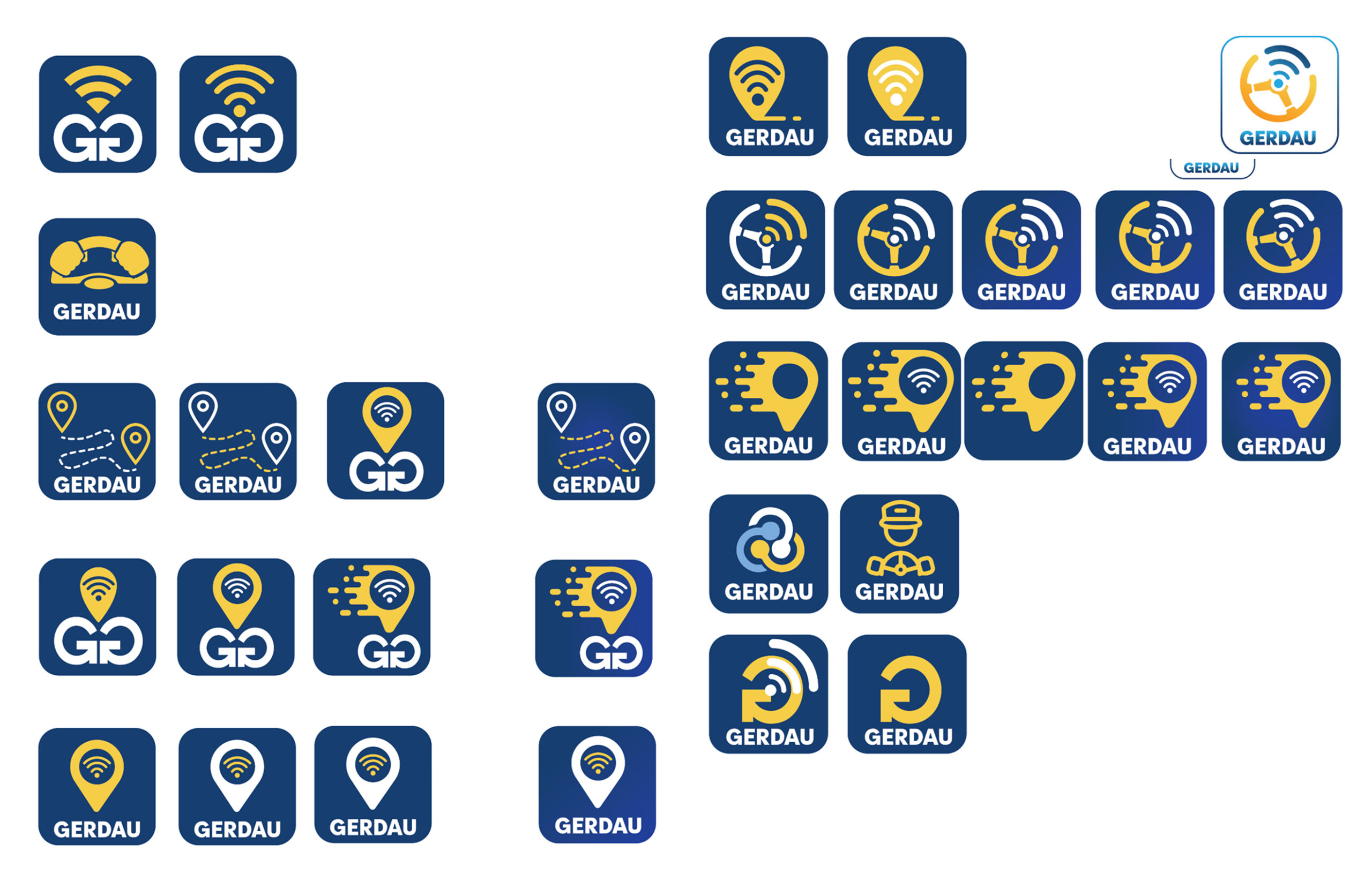
• Logo Design & Concept Development
• Brand Alignment & Visual Strategy
• Iconography & Symbol Design
• Typography Selection & Customization
• Iteration & Refinement
• Scalability & App Icon Optimization
• Cross-Platform Consistency (Mobile & Digital Use)
• Stakeholder Collaboration & Feedback Integration
• Final Asset Delivery & Usage Guidelines